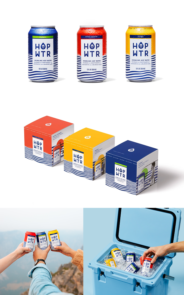
These boxes ARE UGLY! (I can say that cause I did them) we quickly learned that this wasn’t going to cut it.
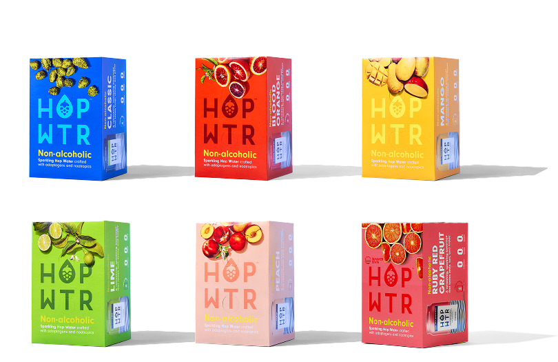
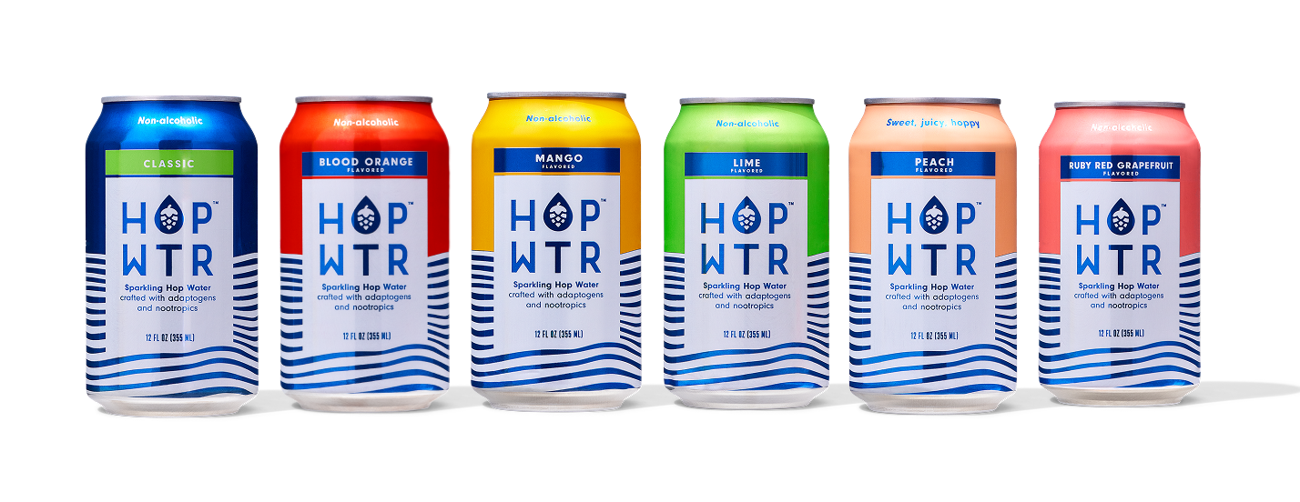
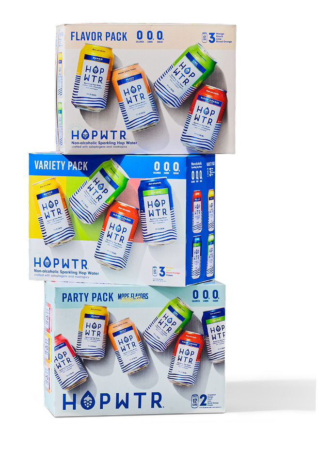
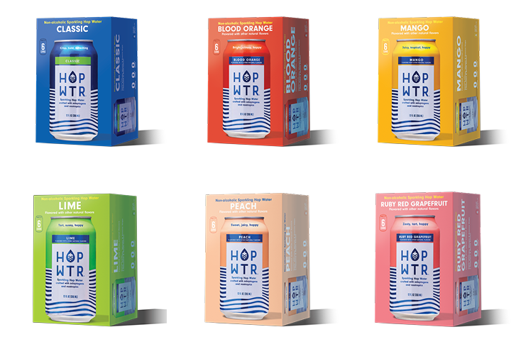
Lime, Peach and Grapefruit were added within the next 2 years and with that came iterations on can messaging hierarchy. Simplification and clarity were top priorities. We made things larger, removed the noise, and changed the text to be approachable and legible on shelf.
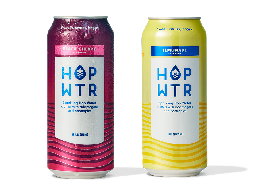
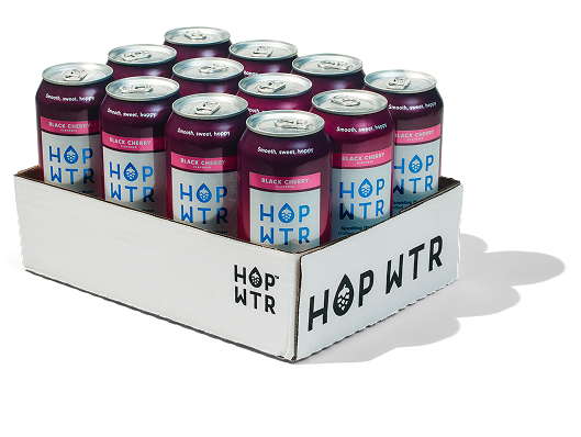
Introducing 16 oz cans for two C-Store specific flavors, Black Cherry and Lemonade, was a fun challenge. It opened up the opportunity to try a flood of color with a monochromatic treatment since proportionally, our bold blue stripes weren’t working.
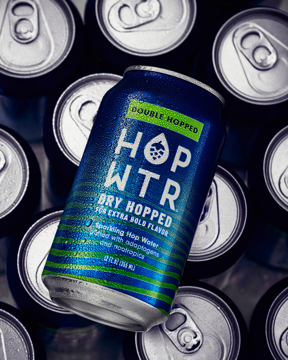
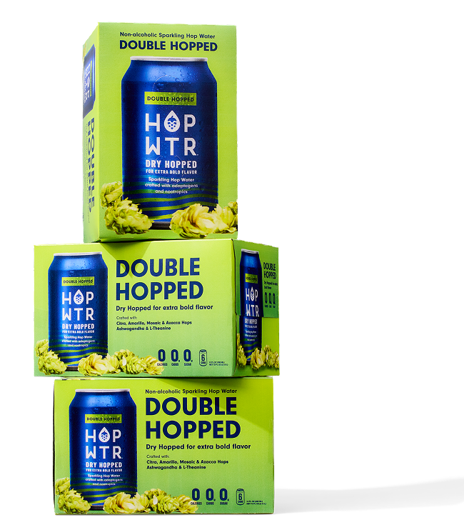
Our next innovation was Double Hopped. It has a bolder hop taste, closer to a non-alcoholic beer and we wanted the can to reflect that. This sku created our first new product line since our launch. With a slightly different demographic, darker visuals and beer-adjacent messaging.
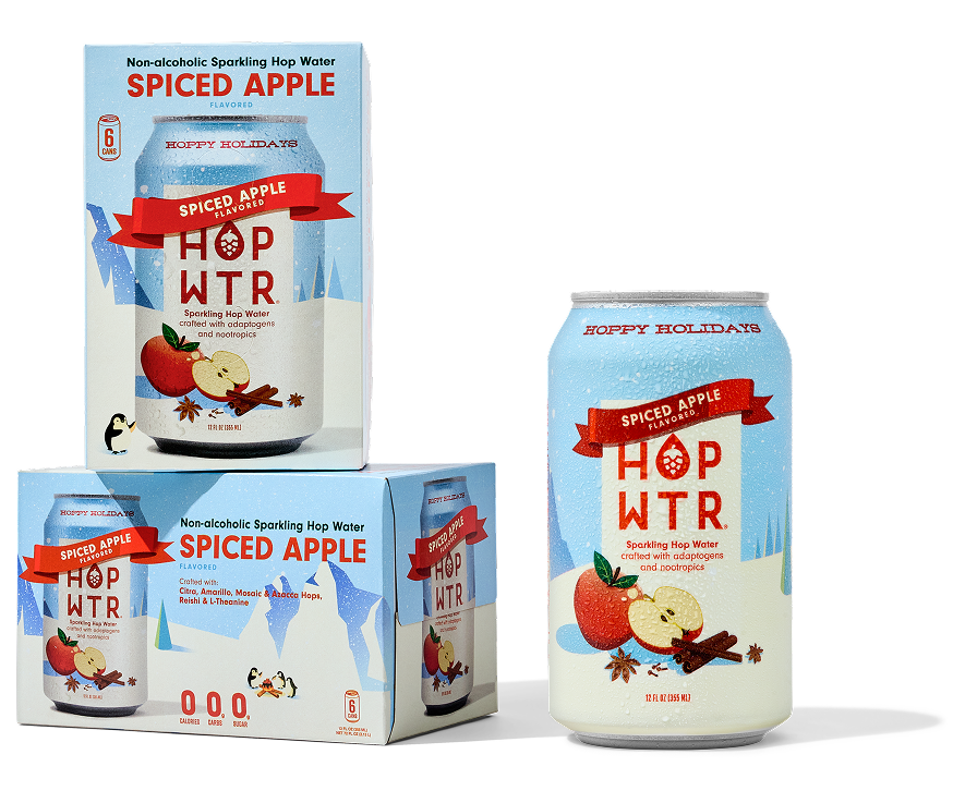
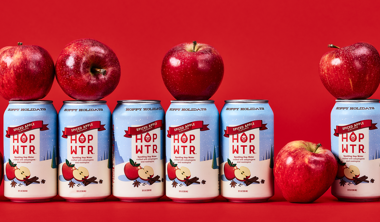
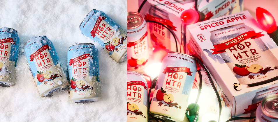
Oh, and why not throw in a holiday flavor with festive packaging! Spiced Apple sold out in record time, creating demand for more seasonal flavors.
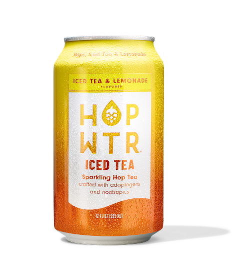
Next, we introduced ICED TEA. The launch represented another opportunity to add a third product line along side our core and Double Hopped products.
As we quickly expanded into retail we leaned into our bright color packaging.
It’s always fun redesigning your own work. Our latest 6-packs continue to highlight our core colors while letting the can do all the work

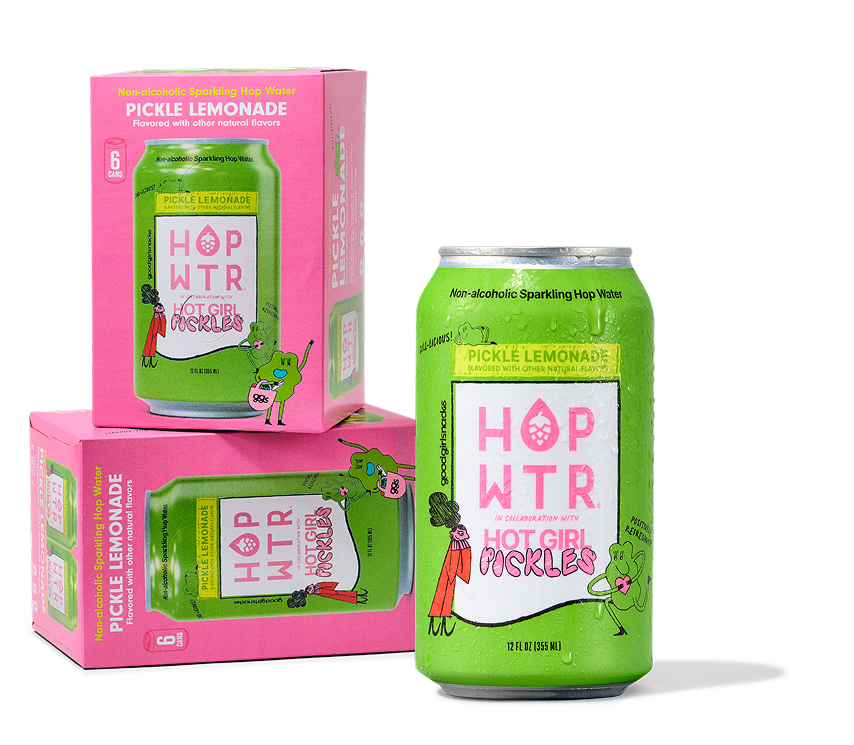
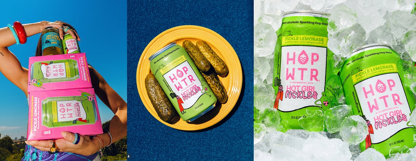
Our second collab was with HOT GIRL PICKLES (Goodgirlsnacks) as the pickle craze grew we hopped (pun intended) on board with this sparkling pickle lemonade just in time for summer.
HOPWTR Packaging
HOPWTR launched in 2020 with three flavors, no real guidelines or packaging solutions outside of the can. We weren’t sold in stores yet, just three colors and some waves.